Challenger Rebrand
While at Challenger, we decided to execute a rebrand to more accurately reflect the company values, appeal to a broader customer base, and strengthen the company's market position with a modern, sleek aesthetic. I provided art direction and creative inputs to an external vendor for the creation of a new logo. The final logo included softer edges and a serif font, which harkens back to Challenger’s origination as a book. Post logo creation, we completed the rebrand in-house with an updated set of brand guidelines and resources, promoted the new brand externally, and implemented the new brand across 1,000+ pieces of content.

An expanded the color palette added vibrancy to the brand. Challenger wanted to appeal to modern, tech-savvy buyers. This set of bright, saturated colors was suitable to a contemporary audience.

Brand Guidelines
To properly enforce and scale the Challenger brand, I wrote a 100+ page Brand Guidelines outlining rules and best practices for our identity. The brand book was divided into sections, including: Challenger’s mission and brand ethos, logo guidance, typographic styling, color usage, imagery standards, voice + tone, our digital presence, and template instructions. The comprehensive guidelines were meant to empower colleagues to feel confident in Challenger’s identity and to create a consistent brand experience for customers.


The guidelines offered technical and practical guidance so the Challenger brand could easily scale internally as well as when working externally with vendors.


I wrote, storyboarded, animated, and voiced-over a video about important news from the Challenger Marketing team. The intent was to share design updates to colleagues in a memorable way and elevate trust in our brand internally. We also wanted to display our video and animation skillset for internal awareness of the creative team’s capabilities.
Resources
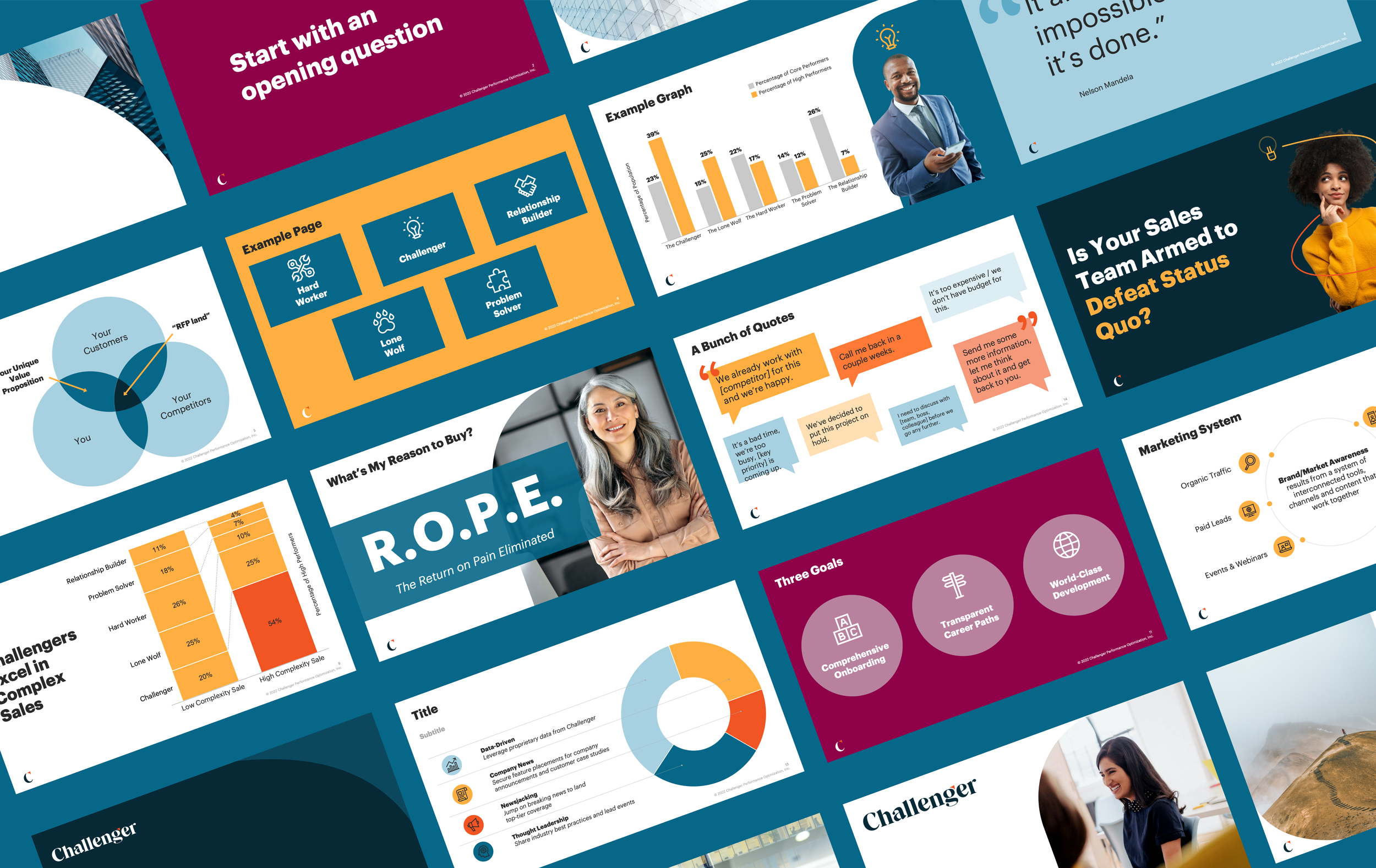
In addition to the brand guidelines, the creative team also supplied the company with plenty of branded resources. Our internal online management system housed on-brand icons, photos, and logo formats. We consciously selected imagery that represented a wide variety of people and body types to reflect our target audience. We also created and maintained a number of PowerPoint templates with custom palettes, layouts, and creative guidance.
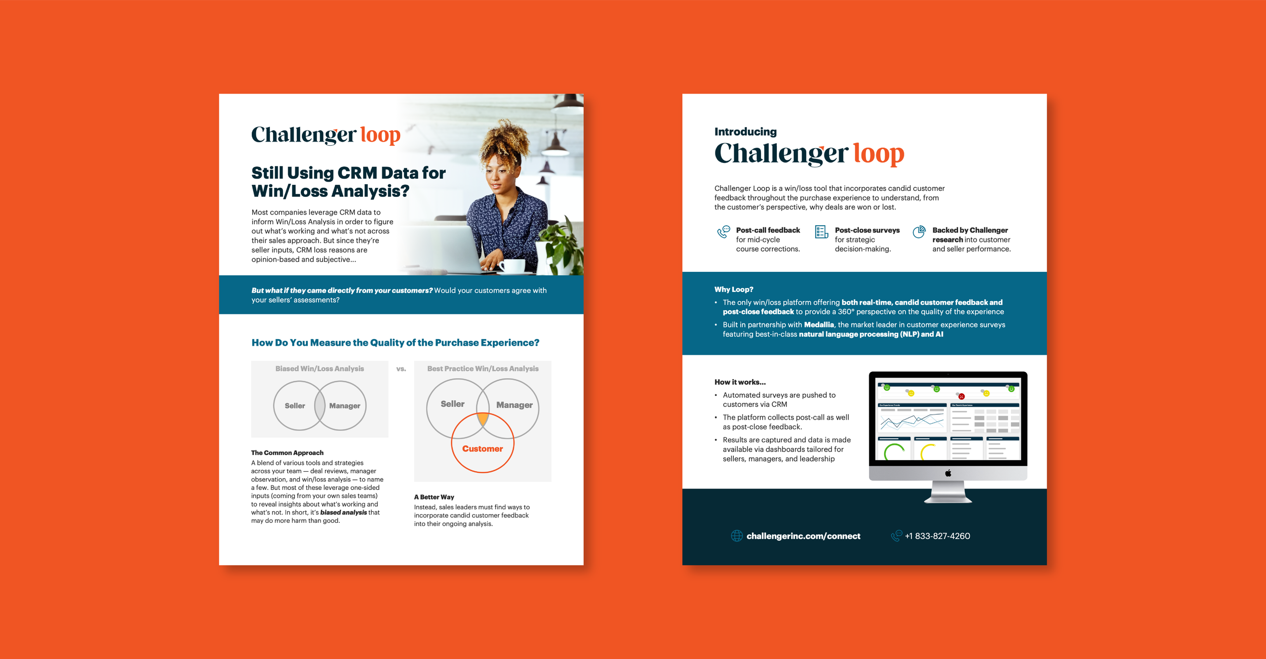
Implementation
The creative team scaled the new brand across many mediums including merchandisers, infographics, academic papers, videos, eLearning materials, sales collateral, and more. When updating collateral, we looked for opportunities to provide simplified graphics, consistent brand experiences, and optimized legibility for accessibility compliance. I managed the operations of the rebrand including intake process, quality control, and communication.