UX Project
wander. is an app that focuses on simplified travel planning. It’s the result of a ten-week user experience design course at General Assembly DC. We learned about a typical UX process through research, synthesis, and design of a product that solved for a common problem.

Problem Statement
Our first step in the process was defining a problem statement. Drawing from personal frustrations while planning trips, I decided to dig deeper into finding an easier way to plan, save, and share itineraries that felt very personalized to the users’ travel style.

Travelers need a simple
way to plan personalized trips.
Interviews and Personas
We conducted multiple rounds of user interviews to test our hypotheses and problem statement. From the interviews, I narrowed down the target audience and defined the persona of a typical user.

Competitive Analysis and Feature Prioritization
I conducted a thorough competitive analysis to understand what is currently available for travel planning. Based on the research, I created a list of features and prioritized what was most important for the MVP launch of the app.


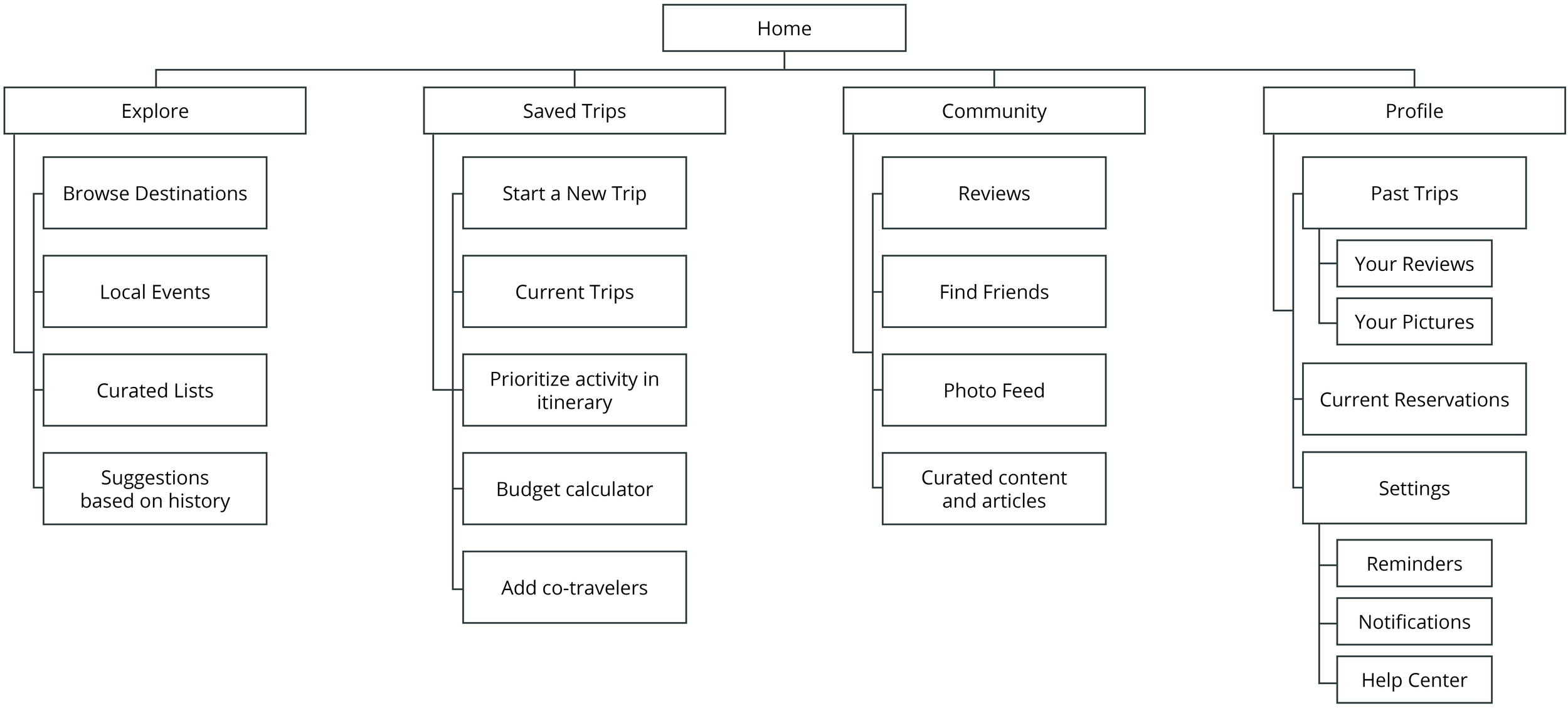
User Flow and Information Architecture
Taking the top features, we mapped out a series of user flows with the main objectives of what we wanted visitors to achieve when visiting the app. After testing the user flows, I constructed the information architecture for how the content would be organized on the app.

Prototyping
I created multiple rounds of lo-fi prototypes to test hypotheses and conduct rapid user testing.

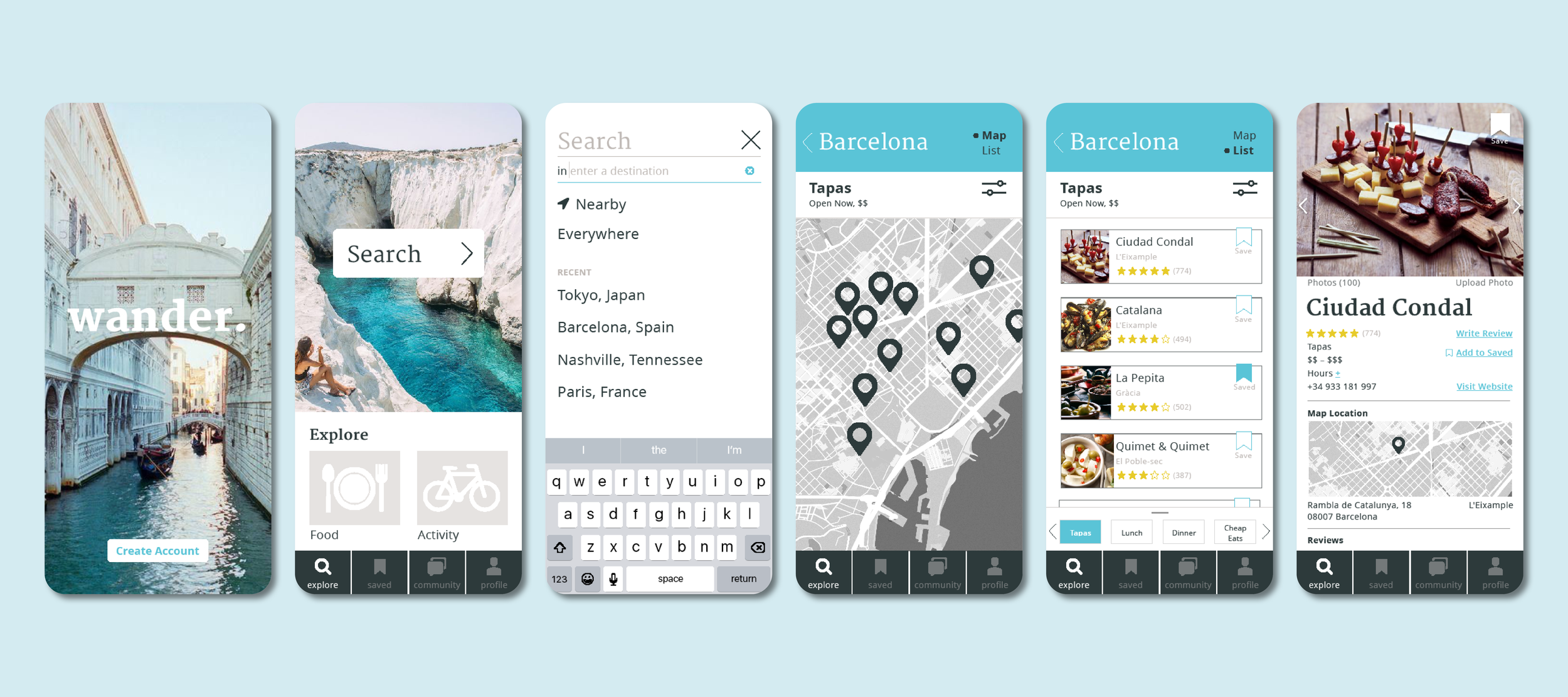
App Design
I started with a mood board of the visual identity for the app. Knowing the personas targeted young females, I focused on highly instagrammable photos with posed scenes. One of the most exciting parts of travel is seeing new and beautiful locations, so photography needed to shine. The color palette has two bright accent shades but is mostly neutral to give photography center stage.